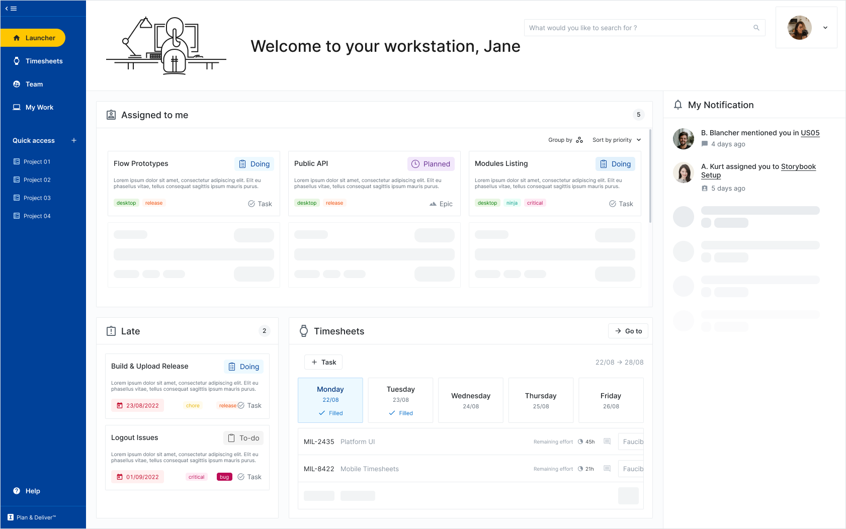
Sciforma + One2Team = 1
The goal of this UI project is to bridge the gap between our two products. The first step of this harmonization would be working on the colors and the main navigation visual elements. The second step would include icons and typography. As we wait for the new Product Platform to launch, this will indicate to the user that both products come now from the same company, and eventually will help go from one product to another seamlessly.
We assume it will also contribute to making migration to the new Platform easier when the time comes.


Also, draw me a sheep
If you are here, you must already know that design is not just about making things pretty. But sometimes we draw really nice things and we throw them away because they were impossible to develop for a ton of reasons. And because being a UX-Designer is building things that work, are useful, aesthetically pleasing, meaningful, and desirable… here are a few pretty interfaces that never made it to implementation.


